IFA Website Design
26th October 2022
After 10 years we have finally bitten the bullet and redesigned our website, it was getting out-of-date.
Screen sizes have increased and styles have changed.
Technology has changed
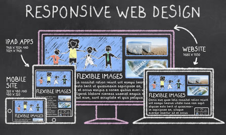
Web design has changed dramatically over the last decade. The greatest change has been technology, including the hardware and software needed to build and design a website. The good news is that website design has definitely changed for the better with much more access using mobile devices and better resolution..Designs too
With the emergence of smart phones, mobile access to websites is giving desktop and laptop computers a run for their money.
As a result, responsive website design has meant that we can now produce a website that re-sizes for smart phones, tablets and desktops. Delivering the optimum user experience on all three types of devices.
Design trends have also changed. People now want information quickly and easily. As a result users often prefer to have important information only one click way.
Our New Website
Our old site (sorry to get techy) was 960px wide, quite narrow but it was ahead of its time. A decade ago, 960px was the suggested width of a website. It was optimized for the most common screen resolution of 1024px!
Not anymore, in 2022 we are working with the following:
Desktop: Above 1440px, Laptop: 992px to 1440px, Tablet: 576px to 992px, Mobile: Up to 576px
Pretty useless facts, unless you're a web developer. But you can see how websites have changed. Moving more towards smartphones which can now perform some of the functions that were once unique to laptops and computers, with the advanced technology that they use.
So with that "hat" on - our site (as does yours) needs to perform well across a variety of devices.
Mobile-first indexing is now a “part of life”, but we thought you might find it interesting to know some of the history and where we are today.
Our New Website (2022)
Our Old Website (2012-2022)
Mobile devices are certainly more popular
The internet doesn't look like it did a decade ago.
Back in 2010, smartphones, mobile browsing, and social media were still relatively new trends, particularly for financial adviser clients who are in the older demographic.
Responsive designs started in earnest in 2015
We were already onboard with mobile responsiveness before this point. But thought it interesting to show the changes that Google made at this time.
Google announced in 2015 that its new algorithm update would 'Significantly Impact' sites without mobile compatibility.
Google made this announcement because it is very much interested in sites giving the best user experience.
Did you know that Google prioritises its users over website owners?
The announcement on Google's Webmaster Central Blog, Google said:
“When it comes to searching on mobile devices, users should get the most relevant and timely results. As the number of people using mobile devices to access the internet in increasing, our algorithms need to adapt to reflect this trend. In the past, we've made updates to ensure a website is configured properly and viewable on modern devices. We've made it easier for users to find mobile-friendly web pages and we've introduced App Indexing to surface useful content from apps. Today, we're announcing two important changes to help users find more mobile-friendly content:”
We will be expanding our use of mobile-friendliness as a ranking signal. This change will affect mobile searches in all languages worldwide and will have a significant impact in our search results. Consequently, users will find it easier to get relevant, high quality search results that are optimized for their devices.
Read what Google had to say in 2015: googlewebmastercentral.blogspot.co.uk/2015/02/finding-more-mobile-friendly-search.html
Responsive website
All our websites are written responsively, to adapt to mobile devices.
It comes as standard now and you need to provide a good experience to those clients who are visiting your adviser website site on mobiles and tablets.
Mobilegeddon
Goodness, that was a long time ago! On April 21st 2015 Google ramped things up - slowly at first. And it had a name “Mobilegeddon”

Google's made an announcement of using mobile-friendliness as a ranking signal from April 21, 2015. The date started being referenced as “Mobilegeddon”. Although Google had announced the update earlier it wasn't until later that it was more forthcoming with details.
Google has been promoting websites that are mobile friendly rather than penalising those that aren't. In 2016 (based on our statistics) the percentage of clients accessing adviser websites using mobile devices (not tablets) rose from 1% in 2012 to between 5% and 6% in 2016. After Covid that figure has been boosted significantly, with the popularity of smartphones and the older demographic becoming much more tech savvy.
We hope you find our new website easier
We want your experience with our website to be a good one. We have tried to put all the information you may need to access quickly, at your finger tips. What we do, who our clients are, what level of service we offer and our prices (even our competitor's prices).
Our aim is to as transparent as possible. We hope we achieved that!